

Case study / Graphic
Field Notes
An editorial design concept for sharing ideas, observations, and work in progress.
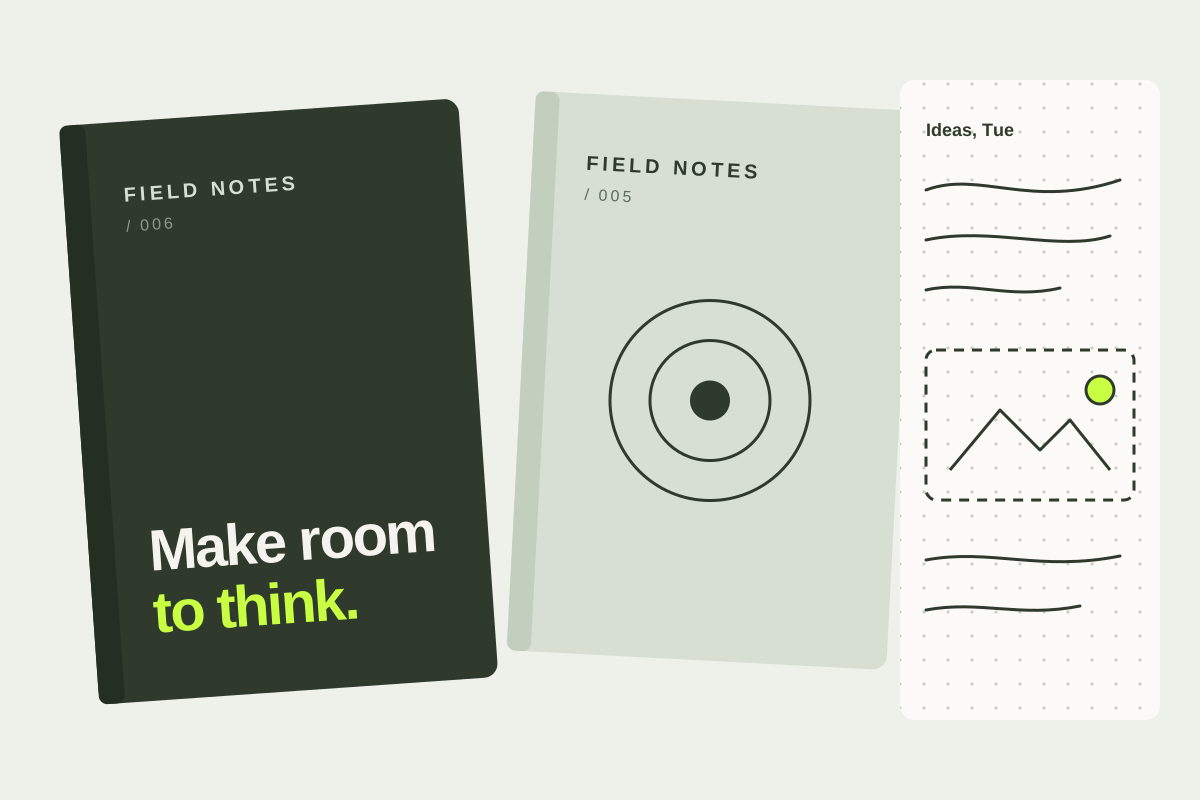 EDITORIAL DESIGN / DRAWTIQ
01 / The challenge
Find the signal in the noise.
A collection of ideas needs a visual rhythm that supports reading instead of competing with it. This concept uses typography and a flexible grid to make each note feel part of one system.
The experience needed to help people make sense of dense information without making the product feel simplistic. The challenge was to establish a clear hierarchy while keeping meaningful depth close at hand.
02 / The approach
Start with the human question.
We organized the experience around the questions a user arrives with: Where do I stand? What changed? What should I look at next?
- Give the most important information a clear visual priority.
- Use consistent patterns for summaries, trends, and supporting details.
- Make key actions easy to scan and understand.
- Use color as a functional cue, not decoration.
03 / The solution
Clarity built into the system.
A considered type scale, restrained palette, modular cards, and simple chart language create a more coherent product experience. Responsive layouts keep the hierarchy intact as the available space changes.
04 / The outcome
Designed for better decisions.
This is a design concept, so there are no verified client performance results or before-and-after metrics to report. In a live engagement, the next step would be to validate the experience with usability testing and measure task completion, comprehension, and confidence.
All names, screens, and results on this page are illustrative concept material—not commissioned client work or measured outcomes.
Have a similar challenge?
Let's shape a thoughtful solution around your users and goals.